Month: February 2015

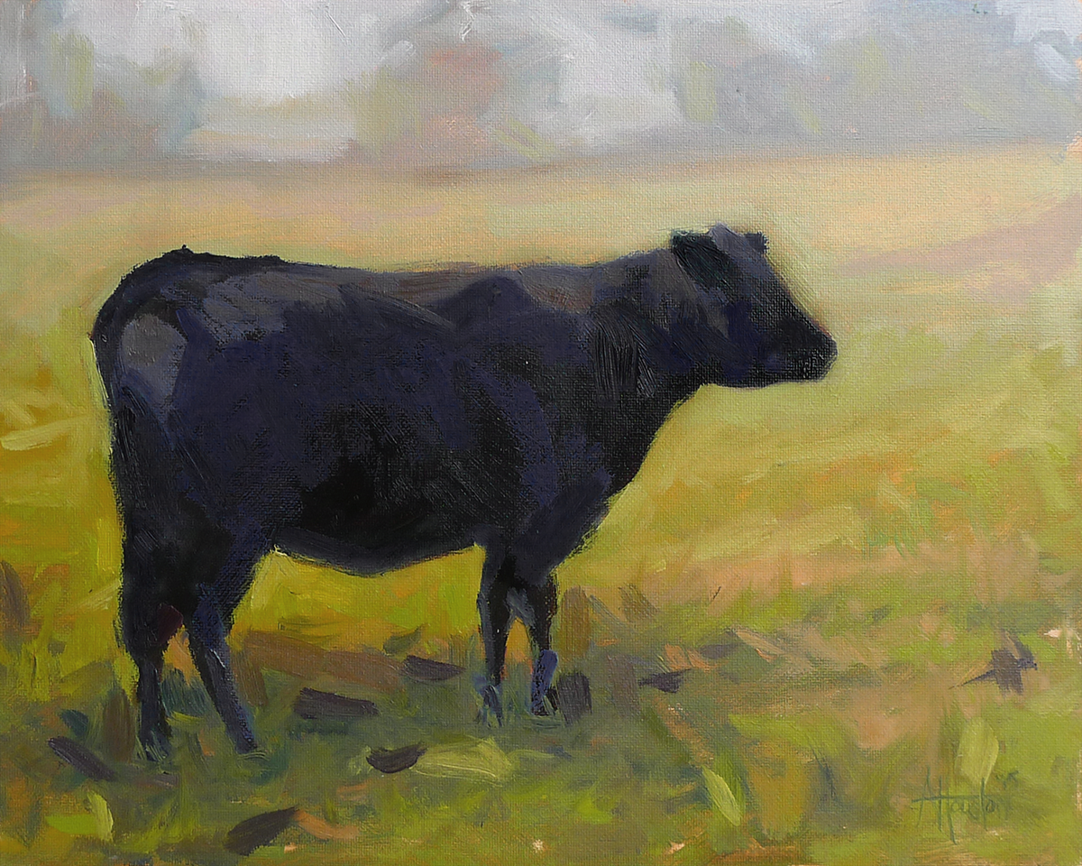
Here is another view of the cows from my Chattanooga trip. I wanted to paint this image because it captured the “misty morning” feel more than some of the other photos I had taken. This particular cow seemed to be very serene and was enjoying the morning as much as we were.

Here’s a small value study of a friend a made while painting in Chattanooga last Fall. I had never painted around cows and for some reason assumed that they would stay away. It’s exactly the opposite. As soon as we got set-up they all walked right over and proceeded to watch the demo with us. I took a minute to grab some photos while they were standing around and have wanted to revisit them since that time.

This painting was done as a part of the class I take with Barbara Jaenicke. My initial reaction to the photo she sent was that it was unpaintable. Watching her demo allowed me to see how to find the painting within the photo.

I was able to get one pass of the colors complete during the class, but it was nowhere near complete. For me, this is where it gets tricky. The progress was good enough that it was a risk to go into it again because I might screw it up.

I let it stare me down over the whole Christmas break before finally attempting to finish it. One of us was going down, and I was at least going to give it my best shot.

Getting back into it felt crazy at times but after a little while I was able to find the rhythm. I think the break was good too because after looking at it again I was able to see the “light story” much better.

Note: This painting was done as part of a class I take with Barbara Jaenicke. The photo, composition and direction on this piece was from Barbara as a part of the class.

There is an amazing grove of oak trees on St. Simons right by the Gascoigne Bluffs. I visited this area  last year with Laurel Daniel during a workshop but did not have the nerve to attempt a painting until now. It’s an amazing place that could serve as an endless source of inspiration.

This one is a more developed version of No. 253. I backed the view out a little more and added in some cows that were edited out in the plein air study. The photo on this one is not so great (camera phone) because it was a gift and now lives with my parents. I forgot to get a proper shot before handing it over. The cows on this one were really fun to paint. Because of the distance the whole form had to be created with just a few strokes.

No. 261 was painted for my sister and her family as a Christmas present. It’s a much more developed version of No. 238 from last year. I had wanted to give them one of the ones I painted on the trip but they were more like studies. And I wanted the one they got to be really good.

Painting this was a challenge and I very nearly gave up on it twice. I get wound up when painting anything larger than 8″ x 10″ and this one was no different. But, the last set I worked through taught me so many lessons and I was able to use those to find the answer.

This painting was done as a part of the class I take with Barbara Jaenicke. She loves to paint snow and is so good with those types of landscapes. I’d only attempted any kind of snow setting once and after receiving the photo we’d be working from I knew this would be a challenge.

What I found most fascinating was the color mixing that went into the snow. My only other snow painting (No. 100) had used mostly cool grays but Barabara puts so much color in her snow. I went a little too overboard with this one but it was great to stretch and see what happens when the chroma is dialed up.

Note: This painting was done as part of a class I take with Barbara Jaenicke.  The photo, composition and direction on this piece was from Barbara as a part of the class. 

No. 259 is a painting of an oak tree at Sutter’s Mill in California. The sun was behind the tree so it had this backlit look set against the brilliant blues, pinks and greens of the background.

This one was so much fun to paint. I was trying to really explore color mixing in the last two and decided to jump in with both feet on this painting. I got lost in the background and my palette looked insane at the end because there were dozens of individual little mixed color areas.

One other strange thing I’m noticing is the way that the paint behaves on linen boards. I’ve testing out some Raymar boards and the linen ones have almost zero absorbency. So the color sits right on top of the board as opposed to parts of it sinking in. I blocked in the background with a warm neutral and the colors sit right on top of the underpainting. I doubt it will translate into the .JPG, but the painting has this almost 3D effect when you look at it. Intellectually, I know it’s as flat as can be but when you tilt it there is this strange depth within the canvas. Don’t know what to do with that yet but it’s cool.

About Adam Houston

Adam Houston is an American impressionist oil painter. He lives outside of Athens, GA and paints the landscape of the surrounding country. In 2010 he began the blog 100 Paintings by Adam where he documented his progress as an artist.  

Subscribe to My Newsletter

©2020 Adam Houston Art, All Rights Reserved