Month: December 2011

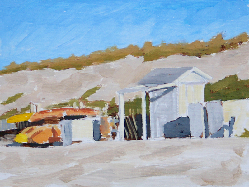
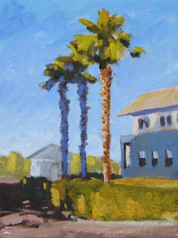
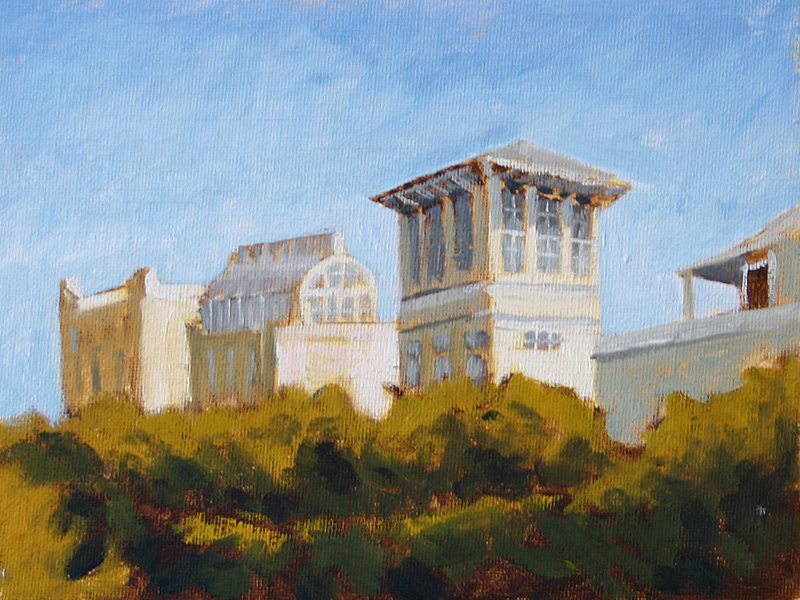
This is actually the same image that is in 177. I cropped in on the little rental shop and took out all the buildings at the top of the dune. Same deal here as 184 – trying to shape a physical object and get the paint to reflect the different planes of space.

No. 184 is a painting of the Sundog Book store in Seaside. I am playing catch-up with these posts so I’l keep it short. Really trying to form the building out of color and give it weight without using back and white.
This one was interesting. I had painted it using Burnt Umber and then laid the first bit of color down but was not happy. The colors were too primary, it was muddy – just not good. But I decided to let it dry and then go back into it. With No. 182 I had done a similar thing and added back more Yellow Ocher to pull it more into a neutral range and not have such a hot yellow tone to it. It’s not perfect but it’s a lot better than it was and it felt good to move the colors from one space to another.
Painting scenes like this are like walking on a tightrope for me right now. I dive in, turn off my brain, push paint all over the place and pray it works out.

It’s like someone who has no idea how to dance that pounds a few Jägers and then cuts loose. I don’t like that.

I want more control and command over this. I am painting these in Burnt Umber and I love the way they start. It’s the color that completely throws me off. I don’t know how to process it all.

Most of the time I am satisfied with the result but am completely frustrated by the path that takes me there. Oh well. This is where that “doing it again and again and again” thing pays off. After I get through all these I need to come back and hit it until I understand it.

This was a tricky one. The sky & water started out blue when I got it to a point it somewhat expected so I decided to mix it up and try to do something with the colors. To give it more interest I just moved the clock ahead and few hours and turned it into a sunset vs a mid day scene. What’s cool is that when I went back in with the yellow it actually gave the trees more of a shimmering feel vs. straight lines.
This ended up being as tricky to paint as I thought it would be. The sky was so brilliant that it’s almost impossible to really paint. It was a busy weekend and I have about seven other paintings in the works and should be back on track over the next few days.
Here is another one with the lily pads. I decided to experiment a little bit with this one and go with a more impasto (super thick) type of application on the paint. I laid the base down with a brush and then put the final layer on using a palette knife. I’ve never really used the knife to apply paint so it felt a little strange.  That said, I think I like this one better than No. 173.
If you walk down Seaside Ave. towards the main square you’ll see this. I thought it was weird how the two palms were in shadow and the third one was lit. A building on the left  is casting the shadow and gave it a strange coloring. As I was about done with this one I remembered how great Edward Hopper’s windows are. It was too late to really fix these but I’m going to focus on the windows for new ones.
No. 177 features one of the pavilions at Seaside, FL. I was a little worried about this one because there was so much detail in the houses behind the pavilion but I just painted what I saw when I squinted.
I probably should have gone back and worked this one a little more. It’s a tad blobby but that is what I wanted to experiment with. There was no real way to paint all the bushes and greenery behind the tree so I tired to make the dabs of color do the work.
Alright – made it to No. 75 for the year. I should have been here in October but at least I am starting to catch up. Basically I have one day of wiggle room to get done in time for 2011 so here’s hoping I don’t hit a creative wall.

This painting comes from Grayton Beach state park. We rode our bikes down a ways and hung out in the park for a few hours. There were some beautiful, untouched dunes along the path that I wanted to paint.

No. 174 is a painting of the chapel at Seaside. It faces pretty much due east so you get some nice light early in the morning. Overall I was really happy with how this one came together and it felt much more natural vs. No. 102 from much earlier in the year.

Lily pads are like cat nip for painters. You know they’ve been done before but there is a siren call that calls you to paint them. I pulled off the road and saw this marsh/lake with these guys and knew we were going to be friends.

The funny thing about this painting is that I was focusing on the lily pads and did not really stress about the reflection of the trees and I think that is what I like best about this one.

No. 172 features a view of the Seaside skyline. One of the things I wanted to work on with this set was painting architecture. I’ve been hit or miss (and mostly miss this year) when painting buildings and so I want to work it until the process makes sense. This one is a step in the right direction but it’s still not right.

About Adam Houston

Adam Houston is an American impressionist oil painter. He lives outside of Athens, GA and paints the landscape of the surrounding country. In 2010 he began the blog 100 Paintings by Adam where he documented his progress as an artist.  

Subscribe to My Newsletter

©2020 Adam Houston Art, All Rights Reserved