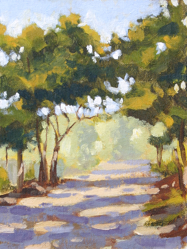
Towards the back of Seaside there is a place where the paved road turns into a gravel road and it’s this perfect little treelined street. At that time of morning (7:00) no one is out and it feels like you are the only person there.
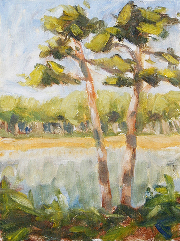
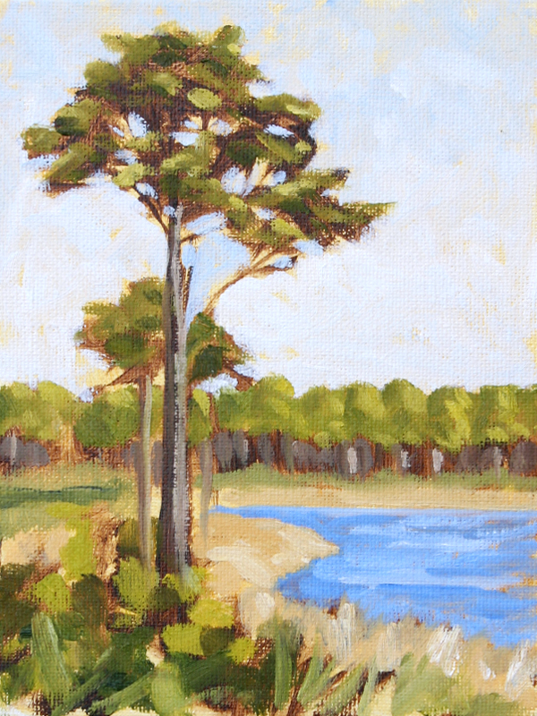
This one was painted outside along a lake inside Watercolor. There were a ton of people around and I don’t like people coming up to me so I hiked out a little bit. This one reminded me a bit of my trees from October and it was fun to try one in the wilderness after all that practice.
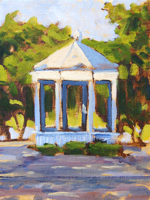
No. 169 is from inside Seaside. Towards the northeast of the community there is this little roundabout with a Gazebo in the center. I had gotten out early to try and capture some of the sunrise light and liked the way the light hit this guy.
This is another painting off the road on 30a in Florida. It’s a decent start but there was so much going on in the image that I was having a hard time boiling it down. I was painting with too big of a brush to really finish anything this size but it serves it’s purpose. This is one for sure that I want to come back to later.
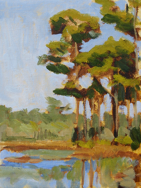
No. 167 was taken from the road on Highway 30a. I love that drive down 30a and there are so many areas where you see the ocean on your right and these lakes/ponds on your left. This one needs some work but it’s a good start. I think once I get through a big set of these beach scenes I will circle around and paint this again.
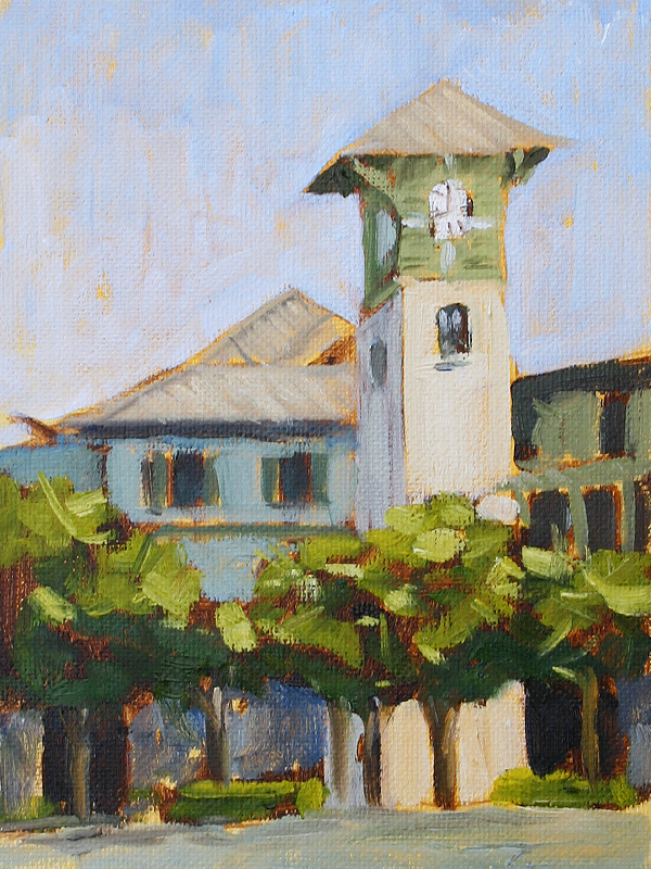
This is a painting of the clock tower that is with all the shops at Watercolor in Florida. I had to sketch this five or six times to figure out how all the different elements fit together before trying to paint this. It looks easy once you get it down but all the detail was dizzying at first.
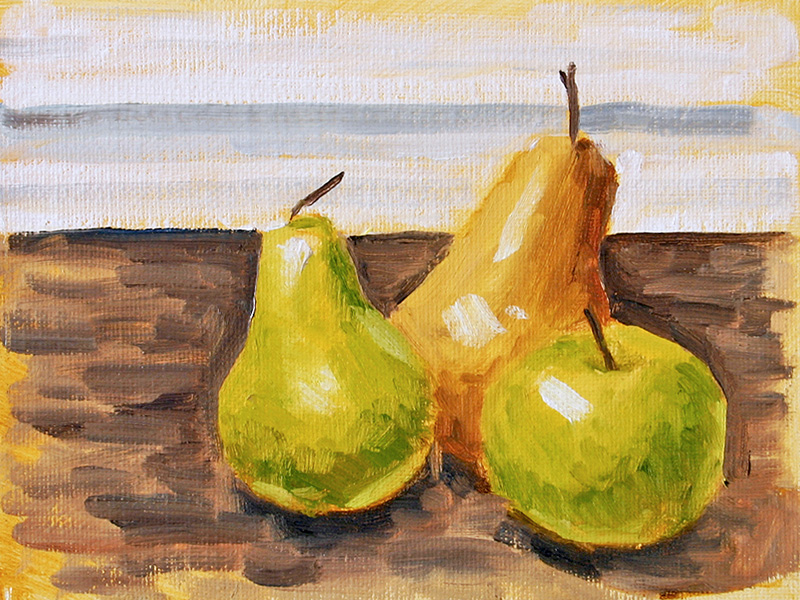
This one is sort of a warm-up exercise. We went to the beach for Thanksgiving and I have a new set-up to paint while away from the home studio that I wanted to try out. The new easel is a Guerrilla Painter Thumb Box and I also bought a brush carrier so I can start painting plein air.
When we got in it was really overcast and rainy so I had to set-up inside to give it all a try. They had some really nice fake fruit so I sat down and painted what I had. It was good to try this out indoors and get my feet wet while it was nasty outside.
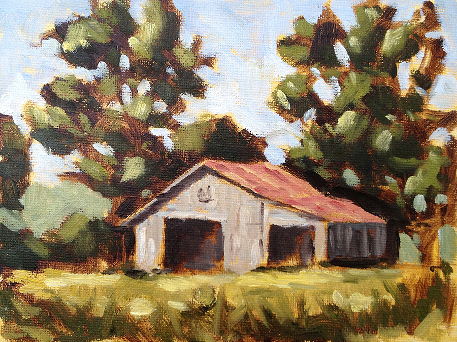
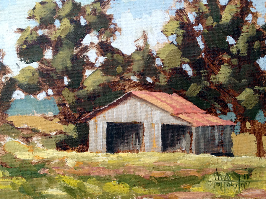
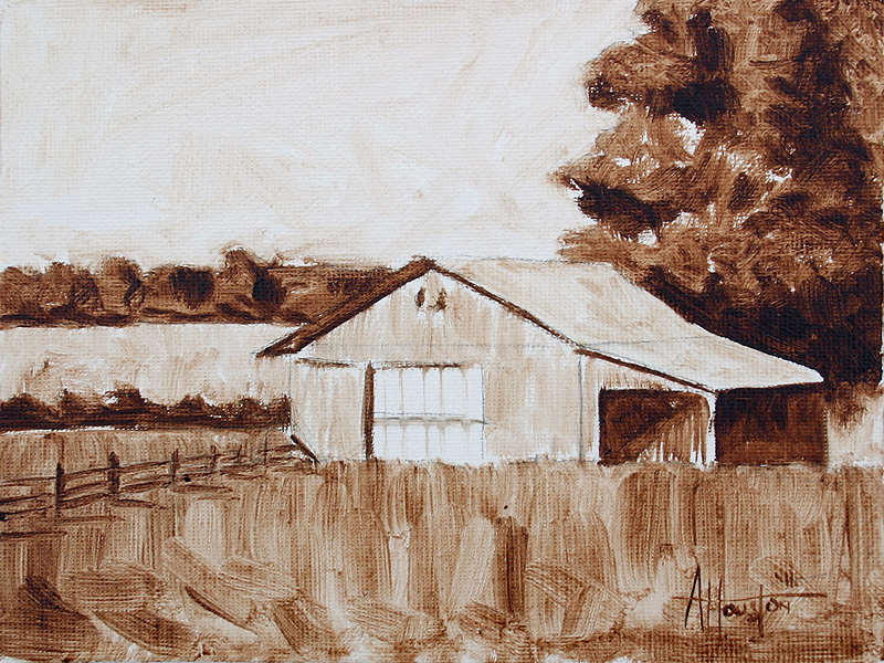
I wanted to try and do 162 just like I had done before. It’s close but not quite the same. The barn is a little wonky. This canvas was totally covered in yellow ochre before starting so any space that would normally be white is golden. Gives it a nice warmth.
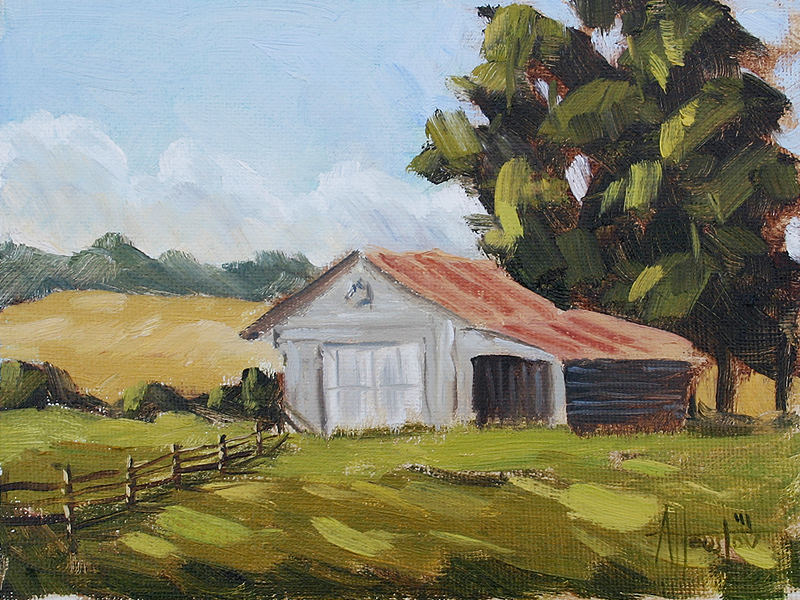
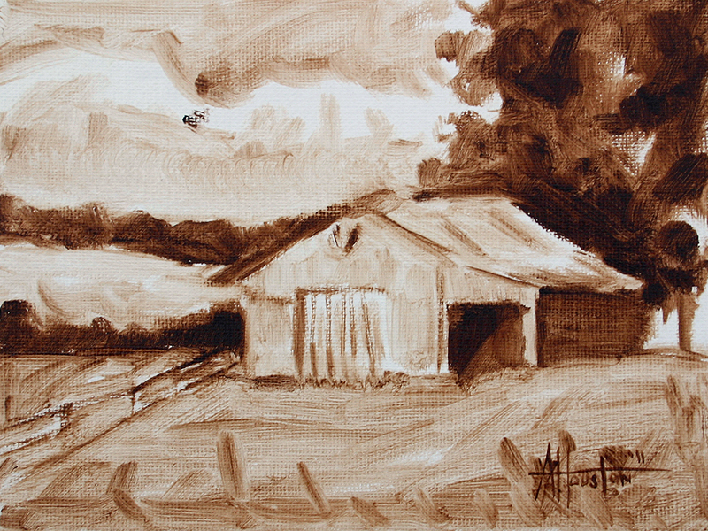
I was trying to do what I had done in 162 but this one did not feel as good. After looking at them together I think it might be the extra trees that made 162 better. The weight is all wrong if there is just the single tree so this one may be the last like this. Also, I only painted the dark areas and there were huge chunks of white. Next time I think I am going to add a tone to the whole thing so it’s all covered before I start.
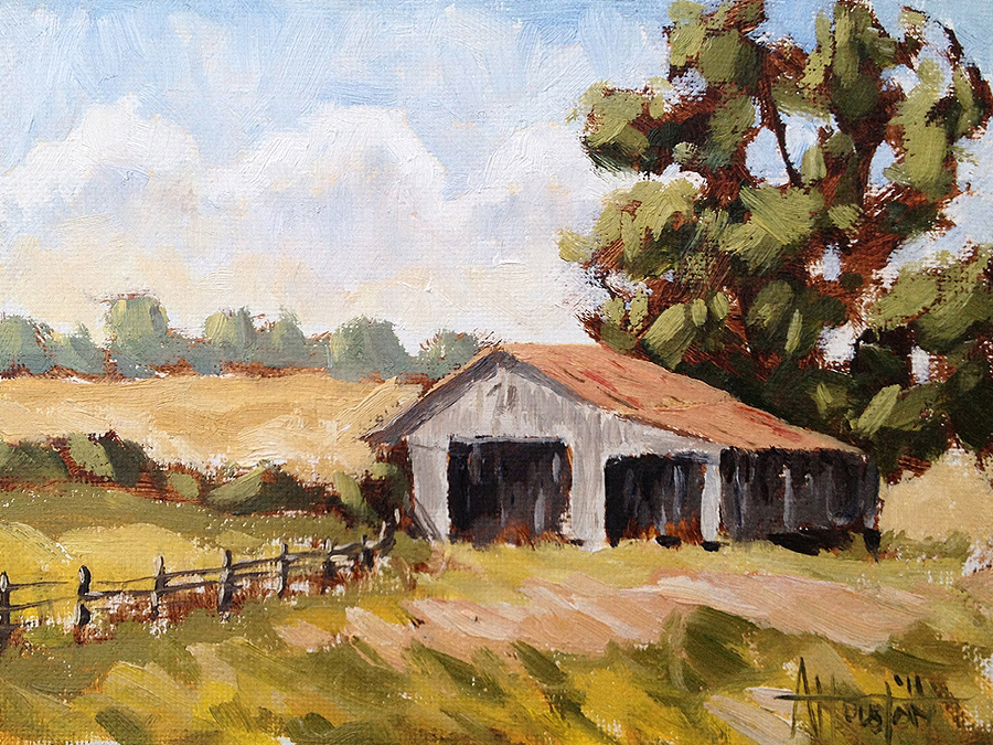
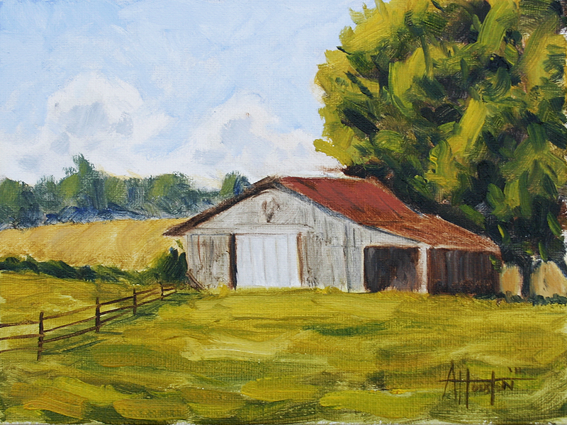
For 162 I decided to use a slightly different approach. This time I painted the whole thing in Burnt Umber, let it dry and then came back on top with the color. I wanted to make the underpainting super loose and then only put a small amount of color on as needed. So if you look in the trees you can see all that funkiness but it still feels tight. This one is probably one of my favorites for the year and it was really rewarding to make some progress after working at these. I loved the process too and plan on trying that again.
I was trying to split the difference here between 159 and 160 color-wise. The tones feel better but the painting technique felt a little lifeless. It was good though – it made me stop and re-think how I was doing it. The one think I like on this one is the light on the fenceposts. That was tricky and feels good.
After No. 159 I really wanted to work on my colors, focus on the tree and see what happened. I have this little William Foster book I bought nearly 18 years by William Palluth about painting in oils. I never liked the stuff in there but he had some very specific info about mixing colors for landscapes.
I had always flipped through that book but this time I sat down, read it and used his mixes. I’m not sure this is exactly what I was looking for but it was really fascinating. Mixing paint is like cooking and he was using recipes I was not familiar with. So it was great to try that out.
The first color version of these is a start. The colors felt way too primary or out of the tube. The tree is a mess and you would think, after nearly 20 trees, that would be the one thing I got right. It’s still a start though and you have to get a base. Clouds are sort of nice.
The last two were so sketched and tight that I wanted to let loose a little bit and give it more feeling. I also decided that the entire top-left area (sky) was so square and blank that it needed some action. So I curved the hills in the background and added some clouds.
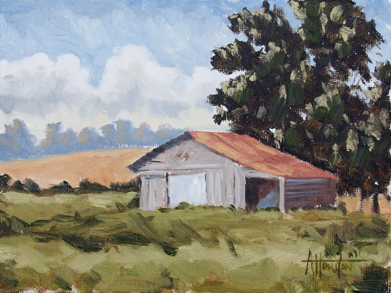
This one is very similar to No. 156 but I tweaked the cropping a little. The barn felt too far away so I pulled it in a bit. Trying to pin down what I want in there before moving to the color versions.
Adam Houston is an American impressionist oil painter. He lives outside of Athens, GA and paints the landscape of the surrounding country. In 2010 he began the blog 100 Paintings by Adam where he documented his progress as an artist.