Month: May 2011

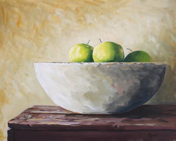
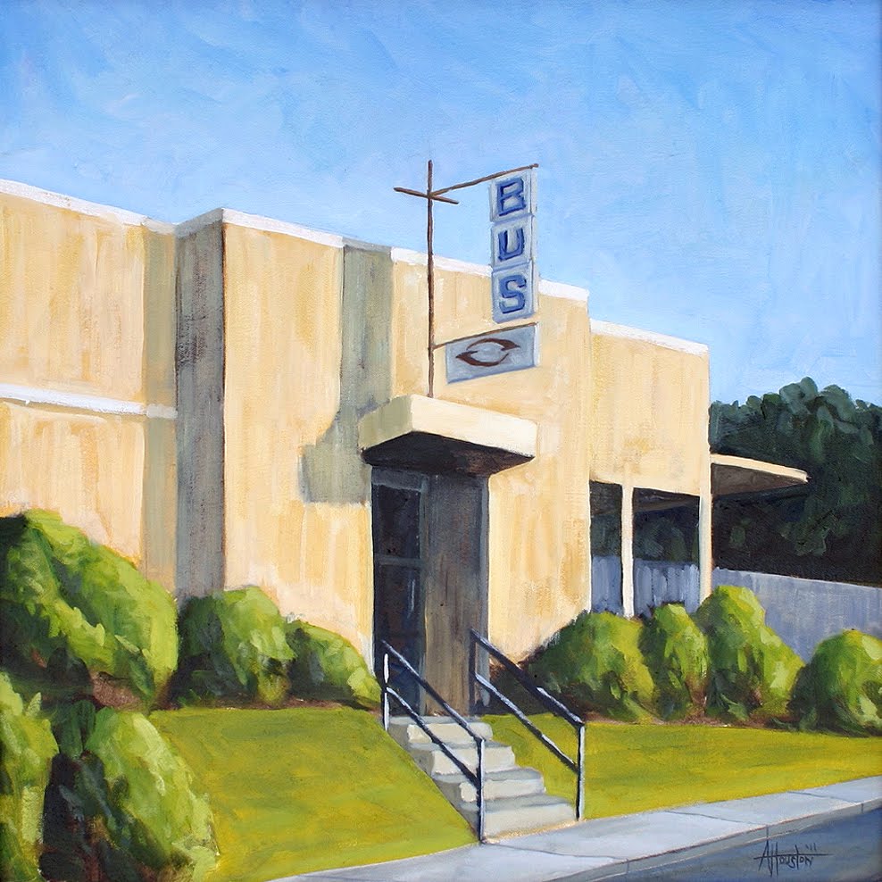
After learning what I did in No. 114 I was ready to try something bigger and a little more complicated. I had been frustrated by No. 95 from last year and wanted to give that one another shot. It was one of those that should have been perfect but it did not seem to work like I wanted it to.

Overall I like this one so much better but part of it may have to do with the size. This is by far the biggest one I have done since starting back and that was fun. Painting it the way I did though did give it all kinds of character that the little one did not have.

This post is a little longer than normal but here goes.

In March I had the pleasure of going to New York for a long weekend with my Dad. I had never been (I know) but really wanted to make the trip because there was a good Hopper exhibit at The Whitney. I’ve read about The Whitney for years and the fact that they had so many Hoppers there was too much of a draw. Thankfully for me Dad funded the trip and we were off.

I had been looking closely at Hopper’s paintings and could not understand why it looked like the canvas was almost bare in spots. It looked kind of scrapped on and in a book it was hard to tell what it really looked like. When we got to the museum the crowds were pretty light and I was able to take my time and really look at each canvas for a long time. After looking carefully at each one it seemed like he painted it on really thin with a color that was darker than the local color. He then went on top of that with the actual color but all this funk was left showing through.

People think his paintings are super tight and from a distance they look that way but when you get up on them they’re crazy. There are almost no straight lines and parts of them are almost abstract expressionist.

This was sort of mind bending for me. My technique up to this point had been to add paint, layer by layer, to shape the final product. This worked alright on the fruit paintings but I could never, ever get happy with my landscapes and especially the urban landscapes.

Also, once I got back I looked through all my books again and really noticed his painting New York Pavements. I could see that he painted every bit of the black on first and then just scrapped the gray of the building on later. No building of layers, no indecision, no struggling with it. He just blocked it out and then barely filled it in. I finally understood how pre-meditated it all was.

Which brings us to No. 114. I had recently sold No. 106 and was happy with it overall but something still felt off. I had a 10″ x 8″ board sitting there and thought – what the heck, I’ll just try it again. I blocked in the darkest darks and then painted the rest of it with a dark version of whatever the local color was. It looked absolutely awful but I knew what I was doing and let it dry. It was pre-meditated and ugly.

So then I carefully went back in and laid the “real” color over that underpainting. Again, I knew exactly what I wanted to put where and just did it. With all my other paintings I was doing a lot of “thinking” on the canvas and this is a whole other way of working.

I was happy with the result and feel better about this one vs. 106. I like them both but this is how I wanted to express myself and it felt so good to finally be able to speak what I was hearing (visually).

Phew. Needless to say this has altered my whole approach so the next batch starts to build off this revelation and hopefully take it to another level.

Here is the last of the Wild Heaven ones. This is the full size, 12″ x 9″ that we used on all the packaging. This one is relatively close to the study, just a little tighter.

Below is a great shot of the four pack taken by Chris Rank who incidentally took the photo of the actual painting as well. A whole lotta Rank going on in this post.

This was fun but we will be back to the normal stuff next week. The year is clipping by and I’ve got to get moving.

Here is the second painting I did for the Wild Heaven packaging. This was the first cut at it to see how the concept worked before doing the final one.

For something like this I would typically look for some photographic reference to gauge how the light works. In this case it was so strange (guy in a robe holding a candle) that even Google could not help me out. So I had to improvise. I lit a candle, threw on my robe and set the camera for auto. I felt genuinely weird doing it but I had to see what the light did before doing the painting.

Here is the finished version of the Ode to Mercy painting for the Wild Heaven packaging. After doing the study as a portrait I had to adjust the orientation to work on the packaging so it’s a landscape now.

We used this for the bottles and the four-packs and below are some photos of the actual pieces in real life. If you are in or around Atlanta pick up some at Whole Foods and give it a try.

I am a full time designer / marketing guy while painting is currently more of a hobby. These two stay separated most of the time but I recently had an opportunity to bring some of my art into my design work.

My good friends Eric & Nick had launched Wild Heaven Craft Beers back at the end of 2010 on draft only but the plan was to sell bottles in 2011. I had been working on a bottle design that had fine art as the central image and the guys liked that basic direction.

I priced out licensing a Nolde and a Schileel for the guys and Nick asked me if I wanted to take a cut at it before we went that direction. I laughed and then thought it would not hurt to try it.

So this was the first of the bunch. The beer this was for is called “Ode to Mercy” and so I envisioned this lonely type of guy playing guitar by himself. I used this painting to vet the concept and see how it would work.

In No. 111 I’ll post the final painting and some samples of the bottles.

Here is the painting that came out of the study on 108. You can click on the image to see a more detailed version. This is the biggest one I’ve done since starting the blog and it was both fun and terrifying to work this large.

For something so simple there is a lot going on in this. The bowl has this cement feel to it, I had to get the feel of beat up wood, the apples had to look like apples and then the light behind it all had to be just right. Lots of different textures in a pretty sparse layout.

Most of it came together without gnashing of teeth. The funny thing was the background. I had it the color I wanted but it was almost perfectly even and boring. I decided to try a line of light going diagonally through the background and that gave it the life it needed.

I recently donated a painting to a silent auction and used a larger size canvas than what I typically work with. Before starting the 20″ x 16″ I needed to get a plan for exactly how I wanted to paint it. So I painted this.

This one is a small (6″ x 4″) study for the larger work. I was focused on nothing but the basic blocks of color, composition and how it all felt once the colors were together. It’s alright I guess but the real value was in making some mistakes here and clearing things up before I did the “real” one.

I’ll post the bigger version this weekend so you can see the before /after views. Plus there is some really fun stuff to post next week.

About Adam Houston

Adam Houston is an American impressionist oil painter. He lives outside of Athens, GA and paints the landscape of the surrounding country. In 2010 he began the blog 100 Paintings by Adam where he documented his progress as an artist.  

Subscribe to My Newsletter

©2020 Adam Houston Art, All Rights Reserved