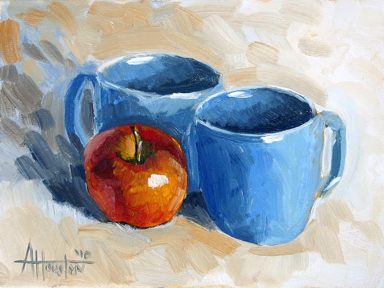
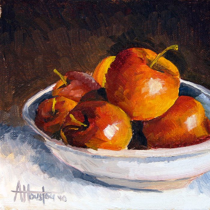
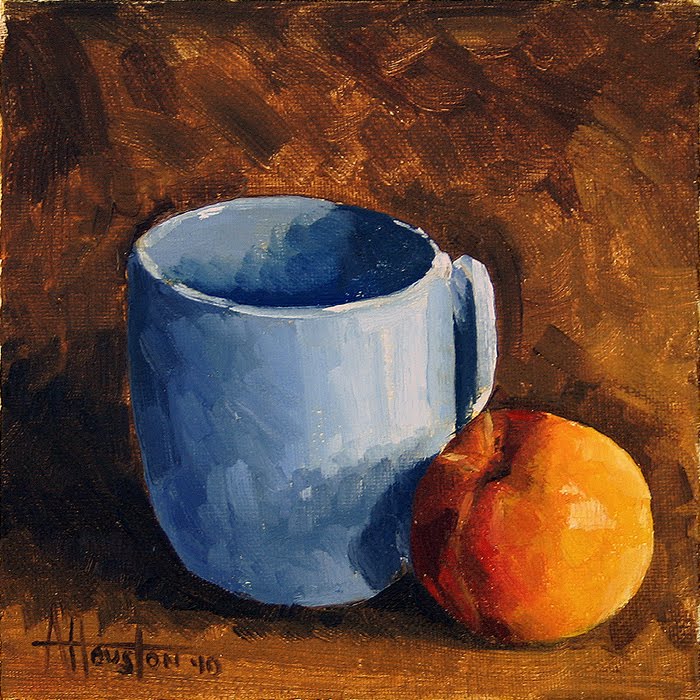
Another apple here but this time I’ve tired two mugs and backed off of them a bit. In hindsight I think they are a little too far back but it would look good in a frame. This one was weird too because the mugs felt really good but I struggled a bit with the apple. You would think after painting dozens of them I’d have them down but it’s still a challenge.
Month: October 2010
- October 31, 2010
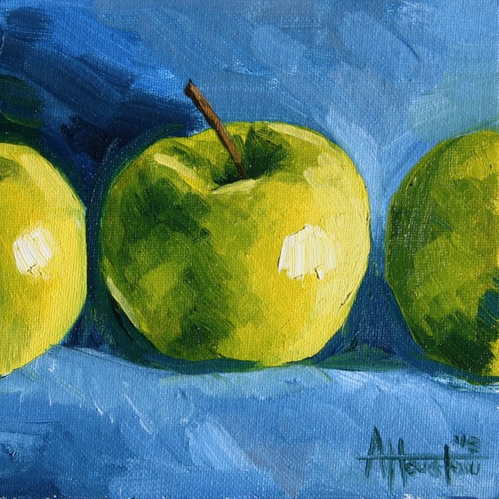
Another one of the apples on blue here. Same goals as last time – be more loose and try a different perspective. It’s not that different but I tried looking at it straight on. I was also toying with the composition by cropping off the other two apples and then having the bright side of one and the darkest side of the other.
- October 30, 2010
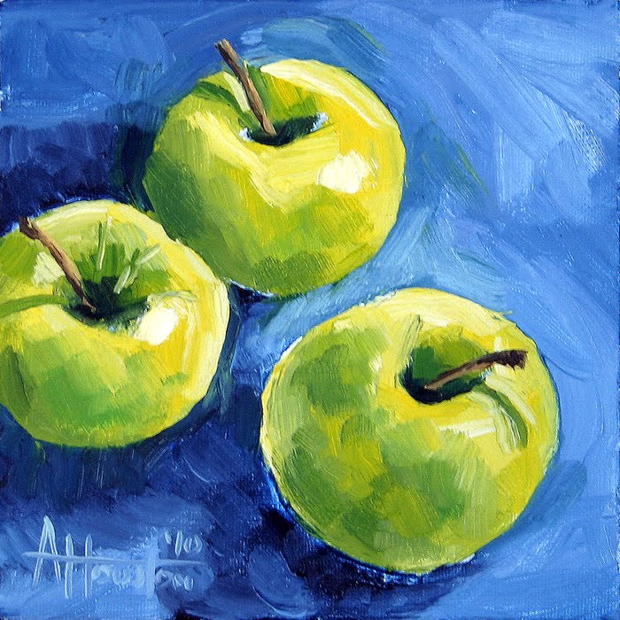
Switching gears here and moving back to the fruit for just a bit. I liked how the last couple of fruit paintings turned out but I wanted to try and be a little more loose and experiment a bit with the color. I think I would paint everything with that brown / ocher background but it’s good to try different things. This one too I tried to look down on the apples to get a different perspective. I was too chicken to try it straight down but this is getting there.
Believe it or not, the red ones are a lot easier to paint. They have so many more colors (which would seem to complicate it) but the variances on the granny smith’s are much more subtle and harder to capture. More tomorrow.
- October 29, 2010
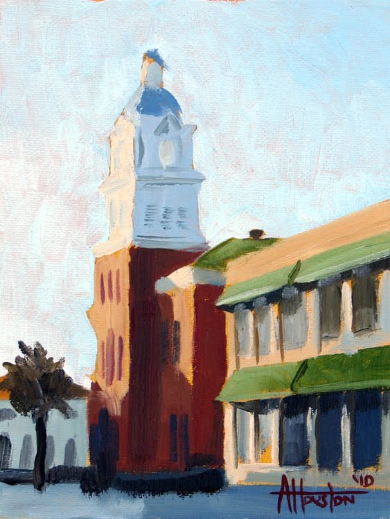
Number 54 is an early morning image of the Fernandina Beach courthouse. Amelia Island is such a weird place because you have the beach, the marsh and then this perfect little downtown – Fernandina Beach.
Before I left for the trip Chris reminded me to get up early at least ONE morning and go take some photos to paint. I’ve learned from Chris that if you don’t get the shot before about 9:00 then you’ve missed your window.
So I dragged myself out of bed at 6:00 AM, on vacation, to go take pictures. It sucked getting up early but was totally worth it. I caught the sun hitting the courthouse and the buildings downtown at just the right time.
I’m really happy with the way this one turned out. I know I’ve done a lot of fruit this year but my heart is really in landscapes. It was a nice diversion to try this and get close to what I was aiming for. My problem earlier in the year was trying to make things perfect and here all I was trying to do was zero in on the light.
- October 27, 2010
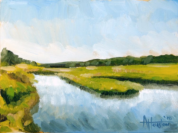
Number 53 takes us back to Amelia Island. This shot came from the same day/walk as number 36. I had struggled with 36 but this one felt a lot more natural. I was a little nervous trying this after just barely getting back into the grove but it just happened without a lot of hand wringing.
One thing I don’t think I’ve mentioned is the fact that I am painting these into a “wet” canvas. Back with the sepia ones I was struggling with getting the paint to do what I wanted. I tried laying down a thin coat of Yellow Ochre that was super diluted with Liquin and it was like magic. This eliminates white spots in the painting and has made it so much more fluid to paint.
This one was done like that and you can still see a little bit of the ochre at the base of the clouds and in the sky. I’ve got another one from Amelia for tomorrow as well but it’s a downtown shot.
- October 26, 2010
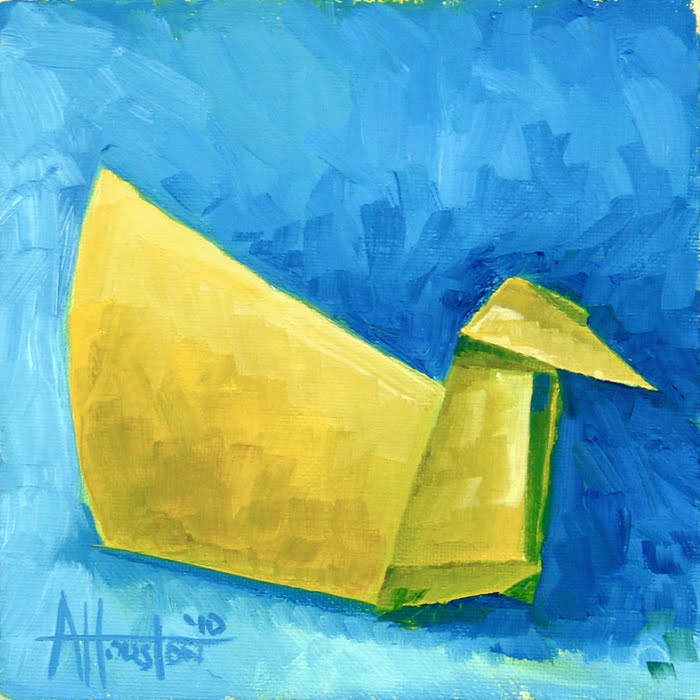
Here is second of the Origami Ducks, Number 52. This blue one is almost an exact mirror image of the last painting. Origami is so design driven that I thought it would be fun to try something like this where they work alone and together.
One programming note is that I will pretty much be posting daily from here on out to No. 100. I want to be done ahead of the Christmas and so that leaves me with just a little bit of wiggle room. We’ll see how it goes but it should be fun to try it.
- October 26, 2010
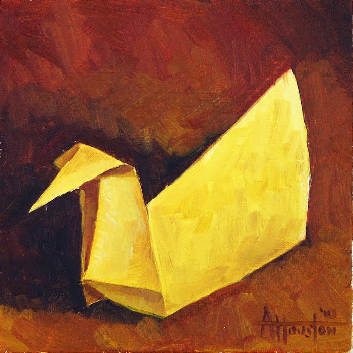
No. 51 is another Origami one. This time it’s a duck. I had done a couple of these way back at the beginning of the year and wanted to try a couple more. This is the first of two that are mirror images of each other. This one is in red and 52 is in blue.
I actually made the duck, put it on a red shirt and painted it from life. Also, this was the one that finally got me to get some actual fabric to paint these on. I had this shirt from Miller Brothers that was very expensive but it was the right color red so I used it. Afterwards I realized how dumb it would have been to ruin that shirt for a $15 painting. So now I have lots of different bases to use instead of the clothes off my back.
The blue one will go up tomorrow. Later!
- October 25, 2010
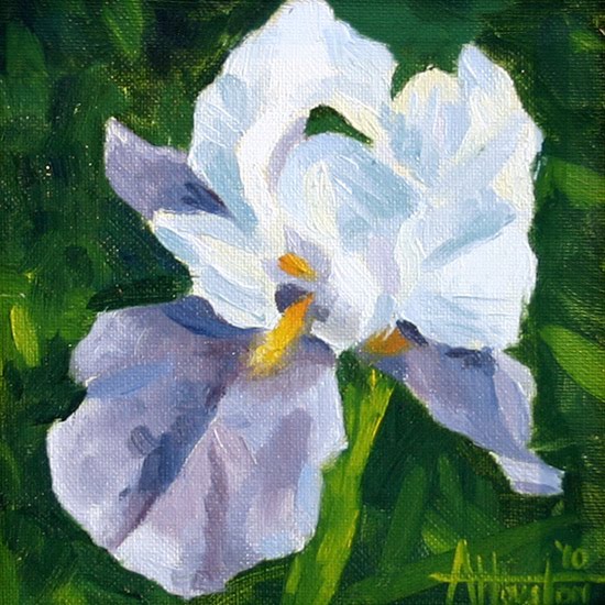
Here’s number 50 which is a special one for a couple of reasons. The first and obvious one is that I have FINALLY gotten to 50. It’s taken forever to cross that line but better late than never.
The second and more important reason this one is special is that it was painted for my Mom. We celebrated her birthday on Friday (number 60 for her) and this was her gift from Les, Evi and I.
For as long as I can remember Mom has grown Irises. Growing up you could always count on the bed of Irises coming up and being around the house. I don’t know if it’s because I’ve always seen her tending to them but I’ve always loved them as well. I remember her doing watercolors of them and being amazed by the paintings. So in thinking about what to paint for her this stood above the rest.
So, there you go. Happy Birthday Mom – I love you.
- October 17, 2010
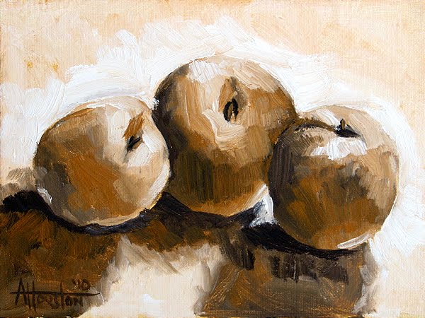
With number 48, and the fear of being back in color, out of the way I was able to really start moving. Number 49 picks up with our friends the apples. I had struggled before when there were a number of different apples in the composition but this one felt better. Same deal as 48 here too. Set it up live, took about an hour with no wailing or gnashing or teeth.
These are also the first few with the 6″ x 6″ canvas boards. I had seen a lot of painters using these and wanted to give them a shot. I like the 8″ x 8″ size but these are even easier to deal with. It’s not too small but still has a limited area so finished them is relatively easy.
- October 17, 2010
So after working in these monotone paintings I finally decided it was time to start really painting again. I was a little nervous after what happened with that one tea pot (the color one) but I took a deep breath, got the nectarine arranged and had at it.
I did the cup and background first and they both felt good so all I had to do was hit the fruit just right. I tried to really, really concentrate and move as deliberate as I could. This was one of those ones where I really did not get up and look at it as I went either. So it felt like I was done, I stepped back to really see it for the first time and there it was – a painting.
I don’t really know exactly how the monochrome ones helped but I know they did. For the first 40 it was never, ever that easy to get where this one is. It took about an hour but this was probably the first one I really got right after one one sitting. It felt good to be back on track.
- October 14, 2010
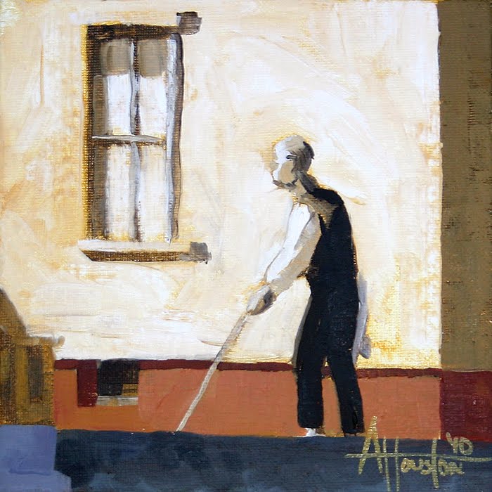
This is the second of the little Pennsylvania Coal Town studies. Instead of doing it at actual size I just cropped out a little piece of the paining and tried to experiment with that as a stand-alone image.
I started this one as another sepia-type but then branched out a bit and added the red to the bottom. It felt good to get back into the color (even limited) and helped get me back on the bus for this next group.
Here is an image of the real painting if you don’t know what I’m talking about:
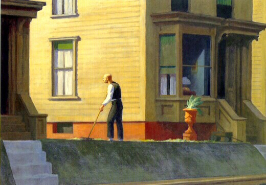
I don’t know exactly why but I have always been struck by this painting. It’s everything that Hopper stood for in one warm but at the same time terrifying image. What can you say about that light? First off, it’s sideways – coming right at the figure. It’s also incredibly hot. As obsessed with light as Hopper was I can’t think of another painting of his that used the time of day to create drama like this one does.
I’ve always seen this as a sunset. The color of the light and the fact that the guy is raking seem to say that. What takes it to another level is how Hopper described light. He used it as a metaphor for life. Light for Hopper was life. If you were in the light and could see the light you were still alive.
So look at this knowing that and what do you see? I see a guy whose time is running out. In about 15 minutes the light it going to be gone. And it’s like the figure is minding his own business and then something triggers in him a sense of his own mortality. He’s watching it go away. You’re raking your yard one minute and the next it’s time to go. It can be depressing but if you look at the image it does not seem all that bad. The light is most beautiful when it’s about to go out I guess.
Not to get all deep with it but I really, really like that painting. I can’t wait to get more into my copy of it and will post the final result when it’s done. It’s sort of lame to copy something but I learn SO much when I look that close at something.
I’ve got a slew of new ones that I’ll be posting starting this weekend. Back into the fruit, landscapes and other fun stuff.
- October 14, 2010
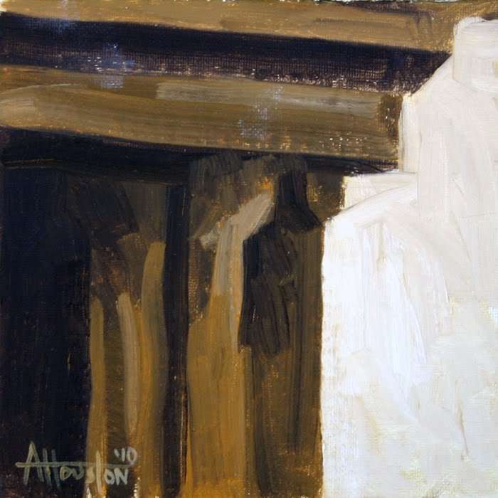
This is the first of two little studies of the painting Pennsylvania Coal Town by Edward Hopper. The little paintings this year have been great but I was jonesing for a really big one and decided to but a 40″ x 30″ big boy and do a copy of that painting.
This particular painting is a life-sized sample of the top left corner of the Hopper. It’s almost abstract when you take it out of context but I was trying to get a feel for the size and feel the real one would have.
Here is a shot of the large canvas with a really rough underpainting blocked out. It’s pretty mammoth compared to the other 6″ x 6″ on the easel. That’s a sneak preview of No. 50.
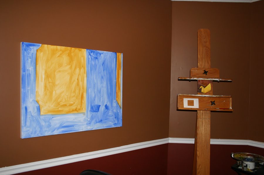
So, a little different for this post but I wanted to mix it up a little bit before moving onto normal subjects.
- October 11, 2010
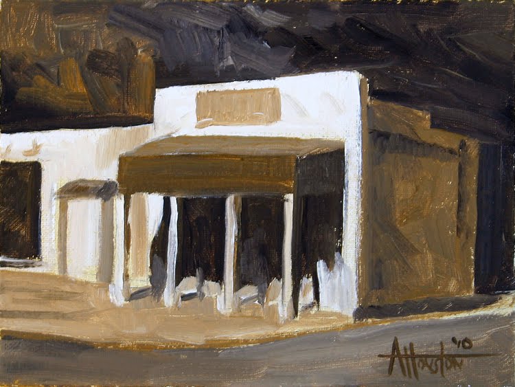
Number 45 is the last of the monochrome ones (at least for a while) and is of the historic square in Roswell, GA. We had an office there for a few years and I’ve passed by this corner at least a couple thousand times. The shop on the corner is Wedding Angels but the square has been there for years and according to Rank this used to be a gas station way back when.
I’ve been incredibly digging the work of Stephen Magsig the last few months and this is my first attempt of doing these small cityscapes. This one is a little rough but does get the essence of the place. Magsig seems to always find a way to boil a landscape down to it’s absolute base but still give the viewer enough detail to make it real.
I’ve got couple weird ones coming up and then we are off to the races again with more color and “normal” paintings. Later.
- October 8, 2010
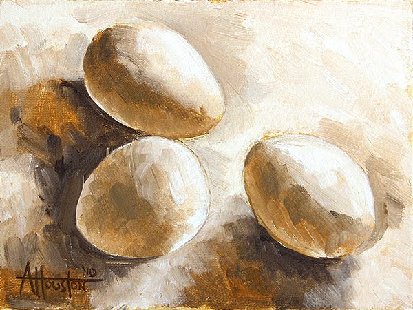
Over the last year I had seen a number of the “daily painters” use eggs as their subject matter. It felt a little like art school all over again but the sheer simplicity of painting eggs is a challenge. It’s basically a white on white type of deal which forces you to let the light do the talking. Using a simple subject matter and a limited palette really allows me to focus on the actual process of painting.
- October 5, 2010
Here’s number 43. Same deal as the last three and the more I did these the better I felt. This one in particular seemed to just happen. Sometimes when you get into it things just click and before you know it the painting is done. Those are the good ones. I was feeling under the weather towards the end of last week so I’ll try to post several over the next few days.
About Adam Houston
Adam Houston is an American impressionist oil painter. He lives outside of Athens, GA and paints the landscape of the surrounding country. In 2010 he began the blog 100 Paintings by Adam where he documented his progress as an artist.
Subscribe to My Newsletter
Archives
- December 2015 (7)
- November 2015 (7)
- October 2015 (9)
- September 2015 (7)
- August 2015 (6)
- July 2015 (7)
- June 2015 (8)
- May 2015 (8)
- April 2015 (3)
- March 2015 (9)
- February 2015 (8)
- January 2015 (8)
- December 2014 (6)
- November 2014 (8)
- October 2014 (4)
- September 2014 (4)
- February 2014 (4)
- January 2014 (2)
- December 2013 (6)
- November 2013 (2)
- September 2013 (2)
- August 2013 (9)
- July 2013 (3)
- December 2011 (29)
- November 2011 (24)
- October 2011 (6)
- September 2011 (9)
- August 2011 (3)
- July 2011 (6)
- June 2011 (8)
- May 2011 (8)
- April 2011 (4)
- March 2011 (3)
- December 2010 (20)
- November 2010 (23)
- October 2010 (15)
- September 2010 (7)
- June 2010 (5)
- May 2010 (3)
- April 2010 (4)
- March 2010 (8)
- February 2010 (6)
- January 2010 (9)
